
4.29.2008


lens crafters
These are amazing and now item #2 on my wish list.
re:vision is the product of Craig Arnold's unbridled passion for cameras, recycling and polishing. Handmade in Adelaide Australia, from discarded camera components and reshaped with love, re:vision brings old school cameras into an entirely new focus.


via bltd
4.15.2008
OBEY Penguin
Just read that Shepard Fairey (Obey Giant) has been commissioned by Penguin to do cover artwork for Animal Farm and 1984. As if these books weren't awesome enough... now they're "awesomer" with the Obey touch.
Looks like Christmas has comer early this year!

via CR
4.12.2008

Zing
For the past few months I've noticed a building in between my place and Central station that has the words ZING written on it. It's a cool, mysterious facade and I've been meaning to figure out what it is for ever.
Today, on the way home from the Surry Hills festival, I finally walked by it and took a photo to share. Come to find out it is a PR firm. Check out their site here.


4.08.2008
Punctuation ZING !
 It's little things like these that make working in an office a little bit better!
via doubletake
4.06.2008
Trucker Font
I'm going to start my nerdy design wish list early for my birthday/Christmas this year.
Item #1
4.04.2008
Kanye West is stealing my thunder...
I thought I was the only dude blogger who talked about all things design and hip-hop... but I was wrong!
Kanye's doing it and doing it well. Not only does he cover what I cover in industrial and object design, but he can actually buy the stuff he blogs about unlike me.
Kanye if you need me to ghostwrite your blog so you can focus on making sweet, sweet music... let a brotha know.

4.03.2008

4.01.2008


3.18.2008
Paige Russel Etsy
Our favorite ceramicist, Paige Russell, has opened up an etsy shop for vintage goods called The Modern Hunter.
We want to wish Paige all the luck in the world with her move back to B.C. and her new shop!
3.04.2008
M&M Propaganda
The new M&M competition print campaign is amazing ! I saw the "Vote Red" poster at my local convenience store on Saturday and I stopped in my tracks to check it out.

Click on images to enlarge.
Obama Swoosh
I love this breakdown of the "Obama Brand" by Michael Bierut. ( who is kinda of a big deal in the design industry)
What are the elements of the Obama brand?
To start, he has this way of writing Obama in upper and lowercase in a serif font and juxtaposing it with that "O" symbol he has--the blue ring with red and white stripes disappearing into it, making the white form inside the blue look like what I suppose is meant to be a rising sun. [See photo above]
That's his "logo," right?
Right. A lot of times when he's at a podium what you'll see is, centered right beneath him, at the very top of the blue field that usually says something like "Change You Can Believe In," it'll be just that little symbol, functioning in the same way the Nike swoosh does. People look at that and know what it means, even though it's just an "O" with some stripes in it.Has any other campaign ever "pulled a Nike"?
Well, Bush did that the last time around with the letter "W," to some degree. You would see somebody with the letter "W" on a bumper sticker, and it would kind of work that way. But Obama has gotten there much quicker and a little more gracefully, if you ask me.How else is Obama's design different than what has come before--or what rival campaigns are doing?
He's the first candidate, actually, who's had a coherent, top-to-bottom, 360-degree system at work. Whereas, I think it's more more common for politicians to have a bumper-sticker symbol that they just stick on everything and hope that that will carry the day.The thing that sort of flabbergasts me as a professional graphic designer is that, somewhere along the way, they decided that all their graphics would basically be done in the same typeface, which is this typeface called Gotham. [See "Change We Can Believe In" sign, above] If you look at one of his rallies, every single non-handmade sign is in that font. Every single one of them. And they're all perfectly spaced and perfectly arranged. Trust me. I've done graphics for events --and I know what it takes to have rally after rally without someone saying, "Oh, we ran out of signs, let's do a batch in Arial." It just doesn't seem to happen. There's an absolute level of control that I have trouble achieving with my corporate clients.
Then if you go to the Web site, it's all reflected there too--all the same elements showing up in this clean, smooth, elegant way. It all ties together really, really beautifully as a system.
Is Obama's stuff on the level with the best commercial brand design?
I think it's just as good or better. I have sophisticated clients who pay me and other people well to try to keep them on the straight and narrow, and they have trouble getting everything set in the same typeface. And he seems to be able to do it in Cleveland and Cincinnati and Houston and San Antonio. Every time you look, all those signs are perfect. Graphic designers like me don't understand how it's happening. It's unprecedented and inconceivable to us. The people in the know are flabbergasted.What does that say about his campaign?
My feeling, in my own narrow sphere as a professional graphic designer, echoes a little bit what Frank Rich wrote in his column on Sunday, where he was talking about Hillary Clinton's argument that Obama doesn't have the experience to run the country properly, and how you only needed to look at how her own campaign has been managed to see the flaw in that argument. I sort of see the same thing. I'm not sure that the commander-in-chief proves his mettle by getting everyone at his rallies to set their signs in the same typeface, but as someone who knows how hard that is, I'm very impressed.The specific choices are also made in really good taste and I'd say to certain degree they also philosophically align with what his position is.
What do you see as the "philosophical implications," to use a highfalutin phrase, of Obama's design choices?
There are a couple of levels. There's the close-in parlor game you can play about what all these typefaces actually mean. Gotham was a typeface designed originally for GQ magazine, so it's a sleek, purposefully not fancy, very straightforward, plainspoken font, but done with a great deal of elegance and taste--and drawn from very American sources, by the way. Unlike other sans serif typefaces, it's not German, it's not French, it's not Swiss. It's very American. The serif font that he often uses to write Obama is delicate and nuanced and almost, not feminine exactly, but it's very literary-looking. It looks very conversational and pleasant, as opposed to strident and yelling. It's a persuasive-looking font, I would say. But that's putting these things on couches and pretending they have personalities.Right. It's sort of hard to imagine in a voter in Cleveland (or a Newsweek political blogger from New York, for that matter) interacting with Obama's design on that level. How does it affect those of us who aren't graphic designers?
Well, I'm teaching this class at the Yale School of Management, and we were just talking about brand management and politics--exactly this thing before we got on the phone. And one of the things that came up in the conversation is, if you think about it, the challenge for someone named Barack Hussein Obama is that he's such an unprecedented figure in American politics--so much so that everything he's trying to do is, in a way, trying to make him look smoother and more normal. Someone said, "Well, why shouldn't he have revolutionary looking graphics--graphics that make him look like grassroots, like an outsider? Things drawn by hand, things that look forceful and avant-garde." But I think he's using design in a way to make him look as normal, as comfortable, as inevitable as a brand can look in American life. Those are really deliberate, interesting choices. Whether or not a sans serif font like Gotham looks more "American" than a Swiss font like Helvetica, that's in our imaginations to a certain degree. I think it's much more incontrovertible that he's actually using the seamlessness of this branding to convey a candidacy that's not a dangerous, revolutionary, risk-everything proposition--but as something that is well-managed and has everything under control.How much have brands like Target or Apple or Volkswagen--these high-design, but essentially accessible brands--paved the way Obama?
I think they're all very much of a kind. I would name those three brands as ones that share a lot with the way this candidate is presenting himself. They're meant to look transparent, open, accessible and democratic to a certain degree. Non-intimidating. You don't feel that this stuff is all being hatched in corporate boardrooms with ad agencies and marketing experts at the table. They all sort of look as if people like you are talking to people like you. Of course, there's a lot of forethought put into all this stuff. But in the end, being able to project an identity that people are willing to credit with being authentic is a hard thing to do. But those brands, and the Obama brand, are managing to do it.With all three of those brands, though, design has in some sense become a form of content. I wonder if something like that is happening with Obama--that people find the seamlessness of his brand compelling and comforting, and they gravitate to him because of it, as opposed to any specific policy differences with Clinton. I'm wondering if you see that reflected in Obama the same way you do in, say, Target or Apple vs. Wal-Mart or Dell?
Oh yeah. There is a difference in the way the experience is delivered between Wal-Mart and Target. Target is gambling on the proposition that people want something that's got more style, that seems more accessible, that's less strident, that's less one-dimensional, that offers a higher comfort level--and they're willing to go with it. There are interesting policy distinctions that you can make between the Democrats and the Republicans and even between Hillary and Obama. But as has been said, the differences are not so pronounced that you're going to be driven inexorably to one over the other. So I think that the affiliation with a brand seems to be transcending these other things. For good or for ill, that seems to be the way the race is playing out this year.What about Hillary?
She's been morphing her Web site* specifically to look like his all the time, so that seems obvious. McCain, to his credit, looks all the more militaristic and blunt and harsh in a way, so I appreciate him sticking to the authenticity.Do you think there's a risk that such a strong reliance on branding and design encourages the perception that Obama is all style and no substance?
There's always that risk, particularly in America--the suspicion that if something looks good, it can't possibly work. If someone's really beautiful, they can't be smart. I don't know why. It's like, in Italy, they don't seem to have that problem, oddly enough. A lot of that had to do with the fact that good-looking, well-designed stuff used to cost a lot -- it used to be a class divider. But now, with the brands you were mentioning, with Target, with Apple, they've become much more democratic and egalitarian in terms of access. Certainly, he's been attacked for being good-looking with no substance. But that's what you would do if you were losing to this guy.
From Newsweek's Stumper feature by Andrew Romano. Get the whole article here.
2.27.2008

2.12.2008

2.07.2008
HOLY CRAP !
Oceanographer Charles Moore has just found 2 patches of "toxic soup" comprised of trash from ships and dumped from land. It is between Asia and America located on either side of Hawaii and both the patches of pollution are about twice the size of the US landmass.
This is pretty damn disturbing... get the whole story here.
2.05.2008


1.30.2008
Posters
Aesthetic Apparatus is poster design at it's best! It takes a speacial gift/knack to be able to come up with this many amazing posters for so many different bands. Great typography and layout.


via typography.com
1.15.2008
Feltron Annual Report at 2modern
I just found the best print design of the year... already. Check it out at 2modern.
1.09.2008
happy New Years
happy New Years kids !
Here's a great poster to go with all the new years resolutions a majority of you guys have made (again) this year....
Here is my first post of the year for 2modern.

12.19.2007
Silly Season...

I know I've sucked as far as posting goes in the past few weeks.... but it is the silly season.
I probably won't be back to regular posting until the new year. If you're going through withdrawls from my witty design ramblings then check me out every Tuesday over at 2modern.
Until then....
11.28.2007
Blog Readability Test
I just put this lovely blog through The Blog Readability Test and guess what they gave it....
Check out your blogs readability level here.
11.27.2007
MO-vember Update...
First of all I want to thank everyone who has donated so far... you guys are awesome.
Secondly, it's not too late to donate to this kick-ass cause... get the details here.
And now the results of the last 28 days.....
( can you tell I went to the beach a lot in between day 7 & 21 ?)
 click image to view
11.22.2007
Play, Live , Create
The new ad campaign for IKEA by Jung von Matt is pretty clever and effective.

11.14.2007
Pentagram Short
What happens when your favorite Media Designer does a project on the most inspirational design firm in the world....
You get an amazing short film ! Scope it out here.
11.11.2007
MOvember Down Under
Hi Kids,
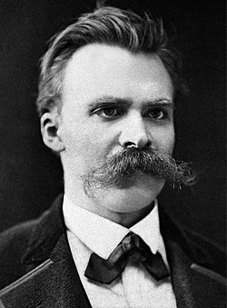
November in Australia is officially changed to MOvember. During the month of Movember ( Mo slang for mustache) I will be growing a lovely sculpted mustache to raise money and awareness for prostate cancer and general men's health research.
I would love if you guys could donate a few bucks in sponsoring my 70's porn-star style mustache, because it needs all the encouragement that it can get. I promise that if you guys have similar causes I will reciprocate with a donation and plug it on the site. Also, I will put up some progress photos very shortly.
To sponsor my Mo please go to http://www.movember.com/au
The money raised by Movember is donated to the Prostate Cancer Foundation of Australia and beyondblue - the national depression initiative, which will use the funds to create awareness, fund research and increase support networks for those men who suffer from prostate cancer and male depression.
For those that have supported Movember in previous years you can be very proud of the impact it has had and can check out the detail at: Fundraising Outcomes.
Movember culminates at the end of the month at the Gala Partés. These glamorous and groomed events will see Tom Selleck and Borat look-a-likes battle it out for their chance to take home the prestigious Man of Movember title. If you would like to be part of this great night you'll need to purchase a Gala Parté ticket .
Thanks for your support
Anand
More info is available at www.movember.com.
Movember is proudly grown by Commonwealth Bank, Holden, Schick and VB.
Movember is proud partners with the Prostate Cancer Foundation of Australia and beyondblue - the national depression initiative.11.08.2007
Sixer to go...
The 6 pack carrier by Studio Oooms is perfect for those BYO dinner outings where a normal 6 pack gets destroyed after you rip out one beer.
The standard 6 pack packaging is not ideal for traveling...

11.07.2007
My Ice Look Fly Up On The Keyboard...
Just when you thought you couldn't hang with the Ghost-dini the God... here he is coming at you in all his Pretty Tony glory... a must have for all Ghost fans.
via iliketotallyloveit
11.04.2007
Creative Building
Visual communication does not have to be complicated... less is more. This is perfectly executed in the new Lego campaign by Blattner & Brunner.
via a cup of jo


10.30.2007
10.25.2007
Innovative CD packaging
This is an AMAZING design solution for a CD case and artwork by Rethink. Making the album for Vonnegut Dollhouse into a.... dollhouse. Brilliant !
The folks over at Rethink have sent me shots of the photo shoot for this kick ass design... check them out here.
Makes the whole thing a lot cooler when you see the process leading up to the finished product! Once again, great work Rethink!
via serif
10.24.2007
Banana Wheels make the world go round !
Out of the box ! new way to display your table top fruit displays with these fruit vessels by Belgian designer Helena Schepens.
That banana one is AWESOME ! Banana wheels are the new black... ya heard !
via siagrafica


10.23.2007
Early Start
Blue Ant Studio is creating an awesome set of alphabet cards for their baby. All the letters of the alphabet are represented by famous designers or famous designed objects....
I think there will be a poster of this available soon... you better believe I'm grabbing one of those.
::UPDATE::
The buzz on the internets for these flash cards was crazy ! So Joel at Blue Ant has created posters for sale. Grab them here.
Umbrella Pot
The kids over at Kyouei Designs have some cool objects but the Umbrella Pot is the best !

Back from the North
Alright folks, back in full effect down in Sydney. The vacation was good. It was great to relax with my fam and get drunk with my friends. Also, congrats to Mr. & Mrs. RDL on their marriage... had a blast at the wedding!
10.03.2007
MIA
Hey kids, sorry I have been missing in action for a while... I flew home to DC a few days back and surpirsed the hell out my folks. It was great... nothing like almost giving your parents a heart attack by knocking on the their door at midnight. It's good to be back and I'm gonna enjoy myself. Will get back to posting as soon as I get back.
Subscribe to:
Posts (Atom)

