12.10.2009

GO Forth!

The new Levi's "Go Forth" campaign is amazing. The "OPioneers" commercials for the campaign is really powerful. I love how well the voice over and the imagery gel together even though they are representative of two completely separate eras. Walt Whitman + young hipsters running around = me wanting to enlist in the military and fight for my country... WEIRD!


The campaign was done by ad agency Wieden + Kennedy, Portland to help revive the idea of Levi's as the quintessential all-American denim brand... and I think it is really effective.

The print campaign is also quite powerful, thanks to the photography of Ryan McGinley. The imagery is really strong, non-traditional compositions and artistic without taking the focus off the product, which people forget about a lot in todays ads. Also, the typography is beautifully done.


.

12.01.2009

Dirt Nap

Love this !
by Carl Bender

11.22.2009

So I can.. So I can

Damn you Corey Hart...damn you. I heard this song on the way home from work and I could not get it out of my head. So I had to design a poster to remedy it. Will go to print with is soon - let me know if you guys want one.

click image to enlarge

11.17.2009

Network Promo

This is brilliant! SO clean and solid.

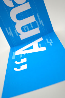
"Booklet containing information and research found during experimentation of Visualising Networks. The aim of the booklet is to promote the benefits of networking in this day and age, from students through to career professionals. The booklet is displayed with the installation piece and is intended to be taken away with the viewer to keep."


By Jason Rubino


11.16.2009

Indie Rock Coloring Book!

I just saw this post over at the CR Blog and had to share!

Originally Posted by Mark Sinclair, 16 November 2009

Like indie rock? Like colouring in? This may well be the book for you...

Yes, the Montreal-based nonprofit Yellow Bird Project has published an Indie Rock colouring book, with illustrations by Andy J Miller, that nicely reflects the DIY spirit of many of the bands contained within.

For instance, you can...

Colour The National's Fake Empire:

Find all the birds in Devendra Banhart's beard (and colour them yellow):

Draw a reflection of a projector, just like on The New Projectors' Twin Cinema album; or colour-in Joseph Arthur's numerous pieces of musical equipment:

Or, and my personal favourite, colour-in the picture "that proves that the water supply was enchanted in the Wisconsin cabin where the [Bon Iver] album For Emma, Forever Ago, was written." Maximum twee points there...

The Yellow Bird project works with musicians to create T-shirt designs, which are then sold on the YB website, with the proceeds benefitting charities of the musicians' choice. More at yellowbirdproject.com.

The Indie rock Coloring Book is published by Chronicle Books; $9.95. You can see more of Andy's work over at Koma Design.

11.10.2009

Velvet at the Black Cat

New [velvet] poster from Fenetik Design.

11.03.2009

The Dead Weather

Last night, while working, I listened to the Dead Weather album about 3 times. ( yes, i love to fall into musical worm holes) This morning the first thing I saw at OMG Posters was this new print for the Dead Weather show in Edinburgh. So I had no choice but to purchase it.


It's pretty amazing! All the Dead Weather posters that have come out in the past few months have been BAD ASS! I really like the ones that The Silent Giants have done. I might need to jump into this and make a poster of my own.

10.26.2009

Bon Iver

great poster...
via

10.21.2009

Paper Planes

Sweeeeet.

10.20.2009

Green Genius

Awesome branding and packaging for Green Genius eco-trash bags.

"In designing this packaging, we focused on a couple key things 1) make it as environmentally friendly as humanly possible, we did so by using 100% recyclable craft board that is 60% post consumer waste and printing with UV inks to make as little impact on the Earth as possible. And 2) design a trash bag package that is actually nice to look at. This included the obvious Glad/Hefty burst, bevel and glowing color madness as well as not falling into the classic "green" pitfalls we all know (i.e. a forest background and a leaf-inspired logo).

With these things driving the design, we created a line of packaging that feels high-quality and pops off the shelves because it sits back."

Desgned by San Francisco based Hub Strategy & Communication.

via

Best. Infographic. Ever.


"The beautiful infographic "50 Years of Space Exploration" [nationalgeographic.com] shows exactly the content denoted in its title. A delimited line on the bottom shows the relative distances in interstellar space, and the current positions of our most distant spacecrafts, such as the Voyager 1 and Pioneer 10. However, the most persuasive part is the nice visual accumulation of fly paths of historic space missions, which clearly shows our past interest in Mars, the moon, the sun and Venus, and the relatively few visits to asteroids, comets and other, more distant, planets.

The image is also available in a more user-friendly and downloadable format on Flickr".

via

Designer vs Client

I know most designers have experienced some of this... if you haven't then I hate you and want your clients.

10.13.2009

Dyson Air Multiplier™ Fan

I know this thing is all over the blogospere but it is quite innovative and damn sexy... for a table fan! Kudos to the folks at Dyson for helping form follow function.

Air is drawn into the base of the machine. The air is forced up into the loop amplifier and accelerated through the 1.3mm annular aperture, creating a jet of air that hugs the airfoil-shaped ramp. While exiting the loop amplifier, the jet pulls air from behind the fan into the airflow (inducement). At the same time, the surrounding air from the front and sides of the machine are forced into the air stream (entrainment), amplifying it 15 times. The result is a constant uninterrupted flow of cooling air.

Learn more about the new Air Multiplier™ here.

Coil Lamp

This lamp by Craighton Berman is brilliant!

Coil Lamp reduces the domestic lamp to the absolute minimum of defining elements. A single electrical cord coils around what appears to be an empty volume, defining the iconic form of a table lamp and ultimately powering a single light bulb.

The entire form is created exclusively from a single 100 foot extension cord that has been wrapped around a laser-cut clear plexiglass form. This simple transformation elevates the status of the humble, everyday extension cord to the realm of high design.

via

10.07.2009

United Steaks of America

How awesome does this steak photograph by Dominic Episcopo look ?!

Check out the rest at Huffington Post.

10.06.2009

Student Loans by the Numbers

Solid visual with some numbers that hit pretty close to home!

click image to enlarge

Check out the original graphic here.

Half Full / Empty ?

Kick-ass prints from Because Studios.


You can grab them here.

via

Hilton Worldwide


This season of Mad Men has Conrad Hilton as one of the characters that DD is becoming quite involved with. In parallel, the real life Hilton Family has just unveiled a re-branding of their corporate identity.


I'm not sure how I feel about this yet. But my initial reaction is that it seems cold and the bevels make my nose bleed ( and not in a good way! ). Also, the typography for the "Worldwide" seems like an afterthought. What do you kids think ?

Here is the old logo.

Also, read a full analysis at Brand New

Return of the Mack

My bad kids... I've been slacking on the posts on this blog due to work and a move to Columbia Heights. I thought I'd get away with it but apparently quite a few of you read this mess. So now that I'm settled into my new neighborhood and work is at a manageable level... I'll start filling your days with more useless design-nerdiness.

8.11.2009

Bright Idea

Pretty clever idea. Adding a duct hose to a Japanese traditional paper lantern.


Designed by Kyouei Design.

via

7.29.2009

One of the Mad Men

If I worked at Sterling Cooper...


Create yourself as a Mad Men character here.

via

7.27.2009

Vanilla Sky

Great poster.


designed by abb-design

via

How to get shot.... by The Sartorialist

Ok. Anyone that knows me (which is all three of the people that read this thing) knows all I usually wear is black t's, canvas shoes and flip flops. Not because I'm hip, cool and trying to keep up with the hipsters. No, more so because I'm lazy and I have the fashion sense of shag carpeting.

One person on the internets that is the king of "street style" and all that is hip in fashion is Scott Schuman with his blog The Sartorialist. He runs around the world taking pics of "really cool people" in their coolest outfits. Now thanks to Christene Barberich & Piera Gelardi ( and designer Joshua Covarrubias) we can all follow this simple flow chart to gaurantee catching The Sartorialists eye (lens).

click on image to enlarge

Cuffed pants, vintage bikes and a scarf - here I come.

via

Wilco Summer Posters

The Heads of State just put up 3 new posters they've done for Wilco summer '09 shows.

Amazing work as usual...

7.21.2009

Fare Play


Clean layout - check
Crisp Custom Typography - check
Clever Copy - check

Who cares how it tastes - i'll still get into it!

Mucca Design has created a stunning package design for Brooklyn based gourmet store, Brooklyn Fare. The branding features a proprietary typeface by Mucca called Fare Serif that is used everywhere and a 4 color system.

via

Neko Case


I just grabbed this letterpress poster - pretty friggin' awesome!


by Bennett Holzworth / you can grab it here

The State

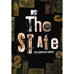
MTV2 Legit is a new block of TV airing on Friday nights that his going to air clips form the original episodes of one of the greatest TV shows of my generation: The State..

If you are in your late 20's to 30's and don't know what The State is: punch yourself then read this.

You can also grab the entire 4 season collection on DVD.