Dirt Nap
 Love this !
 by Carl Bender

Awesome branding and packaging for Green Genius eco-trash bags.

"In designing this packaging, we focused on a couple key things 1) make it as environmentally friendly as humanly possible, we did so by using 100% recyclable craft board that is 60% post consumer waste and printing with UV inks to make as little impact on the Earth as possible. And 2) design a trash bag package that is actually nice to look at. This included the obvious Glad/Hefty burst, bevel and glowing color madness as well as not falling into the classic "green" pitfalls we all know (i.e. a forest background and a leaf-inspired logo).
With these things driving the design, we created a line of packaging that feels high-quality and pops off the shelves because it sits back."
Desgned by San Francisco based Hub Strategy & Communication.

Clean layout - check
Crisp Custom Typography - check
Clever Copy - check
Who cares how it tastes - i'll still get into it!
Mucca Design has created a stunning package design for Brooklyn based gourmet store, Brooklyn Fare. The branding features a proprietary typeface by Mucca called Fare Serif that is used everywhere and a 4 color system.
These labels for Bold City Brewery are out of control!


“In the fall of 2008, Jacksonville, Florida-based Bold City Brewery opened its doors to a community of thirsty beer connoisseurs without a local brew to call their own.
Headed by a mother-son team, Bold City sought a look that would bring character and identity to their selection of brews—as well as tie the beer to its hometown.
The Robin Shepherd Group helped build the brewery’s brand from the ground up, creating a main logo for the brewery, in addition to separate logos for each ale. The Robin Shepherd Group built illustrations that incorporate the Jacksonville skyline and the unique quirks of the brewery and the city. Subjects include Duke, the resident brew hound, an injured and vengeful manatee from the nearby St. Johns River, and “Killer Whale”, the Brew Master’s childhood nickname.
As the brand continues to grow, each logo maintains the levity, hospitality, and hometown pride that Bold City Brewery is now known for.”
Design by The Robin Shepherd Group
What happens when a BBQ Sauce and a Shoe Co. make sweet, sweet love at one of the best live music festivals on earth... a kick-ass collabo baby pops out with amazing package design.
For those heading to SXSW, look out for Supra’s presence. Supra collaborated with Stubb’s Bar-B-Q. A definite out-of-the-box collaboration indeed but a product of the 413 series. Partnering up with Spin Magazine and Stubb’s BBQ, Supra is proud to present the Stubb’s Skytop.viaThe Skytop takes its name from one of the best places to eat and see live music in Austin, Texas and takes its look from their world famous barbecue sauce. To coincide with this release, we have created a special edition package that will only be sold at Stubb’s Bar-B-Q this Friday in Austin, Texas (address below).
This special edition package will include a pair of Stubb’s Skytops, a 2009 SXSW apron, a bottle of Stubb’s sauce, all inside a handmade wooden numbered box that is branded with the 2009 SXSW seal. There will be ONLY 50 boxes for sale this Friday from 10am-11am.
Just when I thought I was the only sneaker head / typography nerd / package design geek in town... Jason Markk comes along and blows that theory right out of the water. This sneaker cleaning kit is amazing - the packaging is simple and well designed, the product label has beautiful typography and a color palette that compliments the solution... and it will clean my sneaks!
I salute you Jason Markk for creating a product with JUST me in mind!
“Designed specifically with the sneakerhead in mind, Jason Markk Premium Sneaker Solution is the first sneaker cleaner to cater solely to the sneaker boutique market. This product does not contain any harsh chemicals or abrasives, is 98.3% natural, and is completely biodegradable. Jason Markk P.S.S. is a gentle, foaming solution that effectively cleans and conditions, removing dirt and stains that inevitably occur during wear. ”


If I were to be reincarnated as a beer bottle ( think about that one )... I would want to be a Bards Beer.
"Bard's Beer is America's first gluten-free beer and the only one that is crafted with 100% maltedvia
sorghum to achieve traditional taste and aroma.
It began as a tale of woe: two self-professed beer aficionados discovered that they were allergic to wheat, one of the main ingredients in 99% of beer. After crying in something other than beer for awhile, they decided to take action: They crafted Bard's Tale Dragon's Gold, the first gluten-free beer to use 100% malted sorghum to achieve traditional beer taste and aroma. Although they quickly became one of the top four players in this niche market, Bard's soon began to see major competition (Anheuser-Busch). To survive, they had to find a way to separate themselves from these interlopers while staying true to their craft origins.
Problem/Challenge
Hunt Adkins objective was to re-brand Bard's so it spoke to the gluten-free enthusiast market without alienating the craft-beer drinker‹those guys who will not compromise one iota on taste. Bard's needed to speak to the beer drinker in all of us instead of the gluten-free beer drinker in some of us.
Solution
In order to position Bard's as the gluten-free beer of choice and get it into the consideration set of all beer drinkers we leveraged the essence of Bard's, which was this: Bard's was created out of a love for beer. Unlike some competitors, Bard's was never about exploiting some market niche. It was created to protect everyone's inalienable right to pull up a stool and drink a cold one with friends.
Bard's hadn't just given people a great beer; it had given them camaraderie. It had invited them back to the stool where they could discuss it over a Bard's. From posters to packaging, from a complete website redesign to the underside of every bottle cap, we gave Bard's drinkers something to talk about. What does it take to be enshrined in the North Dakota Irony Hall of Fame? What exactly is the best course of action in the event of a zombie attack? How does one successfully answer the "What's your greatest weakness?" question in a job interview? These topics du jour remind us that the best part of having a beer is having it with friends.
The new packaging launched in November of 2008 and can be seen in 26 states and a Canadian province or two."
Alright folks, it's a proud day for us at Fenetik Design. Our first package/label design has finally arrived. The client just sent us these pics of the juice labels we designed, as they are literally rolling off the assembly line.
I had to share - this is the closest thing I've ever had to a child. We've named it - O.J. Fenetik.

I didn't really get into wine (or goon) until my adventures in Australia. Alcohol is quite an expensive habit down under so many of the locals, or the ones that I hung out with, really appreciated boxed wine. I never really came across any boxed wine with eye-catching ( in a good way) package design... until now.
Now you can get a box wine that looks awesome and will get you drunk (win, win).
Conveniently available in 3L & 5L sizes.

Check it out at hauswein.de
via
If I were a single malt scotch... I would dress EXACTLY like this. How awesome is the packaging for Highland Park ?!


 via dieline
I love the way these juice bottles are photographed...so quirky and original. Just like the label design. (by: Klas Ernflo)

Wow... this is HIGH-larious. Make sure you check out the site and it's amazing content. Flavors include:
Carmichael Lynch Thorburn has designed this brilliant packaging for Benjamin Moore's new super-duper gourmet paint line called Aura.
Look carefully... one of those petals in the flower is a splash/stroke of paint. Yeah... I know... subtle and so DAMN CREATIVE! Mr. Thorburn, when you google yourself tomorrow and then come upon this post, could you please let us know about the process for that design. Pretty please!

 via dieline (my new favorite site)
 The Dot Grid Book is a must have for anyone who is done with lined or square grid pages. Replace your dark, overwhelming lines with this subtle dot grid. The "dot matrix" is perfect to keep you on the right track and when you scan in your sketches the dots are too light to be picked up.
from how
--------------------------------------------------------------------------------------------
Here is a prime example of "intoxicatingly" delicious and consistent graphics. It doesn't get much better than this !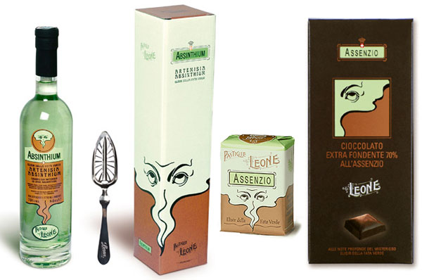
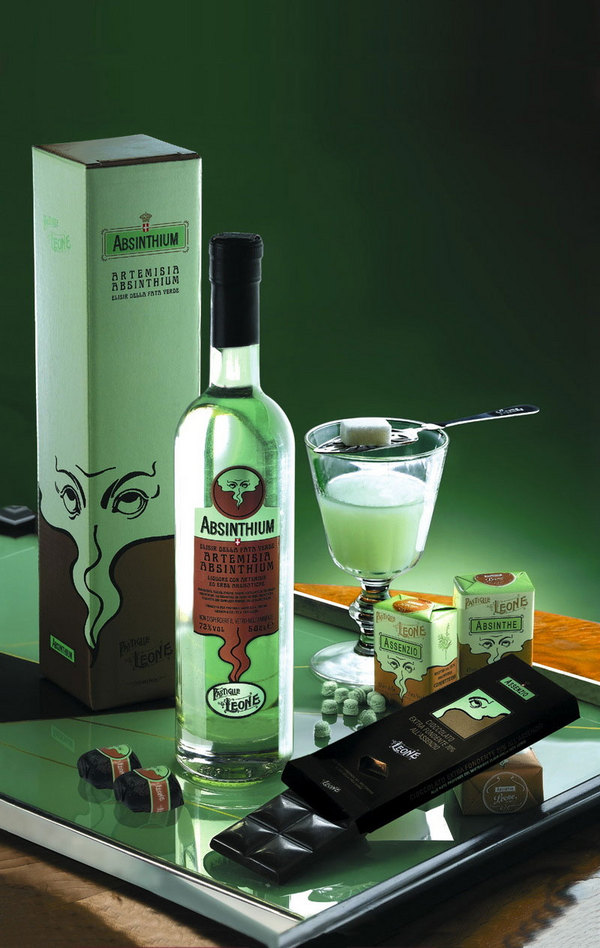
from NOTCOT
--------------------------------------------------------------------------------------------
Thanks to NOTCOT, I've discovered some of the funniest e-cards ever. They remind me of Get Your War On with the silly captions grouped with a generic static drawing. But PLEASE look through these at someecards.com and send your friends, family and ex-girlfriends the appropriate cards. A little random humor never hurt anyone !


